There are around 200 Selected Presentation Posters that will be part of the 2020 AAEA Virtual Meeting. Poster Presentations will take place during the following dates and times:
To view the full schedule of sessions, please click here.
Replace text with graphical elements as much as possible (e.g., photographs or maps of study's location, other visual aids to convey key results), but do not forget your complete contact information. Consider including a photograph of the presenting author.
Clearly indicate your key message. Avoid clutter and unnecessary detail. Don't fight the reader's gravity-pull from top to bottom and left to right. Remember graphical elements, such as balance, symmetry, rhythm, repetition, and change.
Any text in your poster should be readable from 6 feet away, including text in figures. This means no text should be smaller than a 20-point font. The title should be much larger and readable from a distance (12 feet or more).
Use fonts without serif, but bold. Use dark letters on light backgrounds. Use color carefully; very bright colors can easily fatigue the reader. Stick to a theme of 2-3 colors.
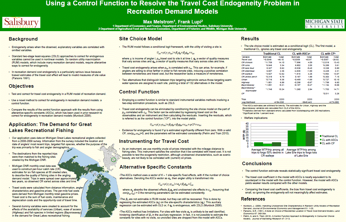
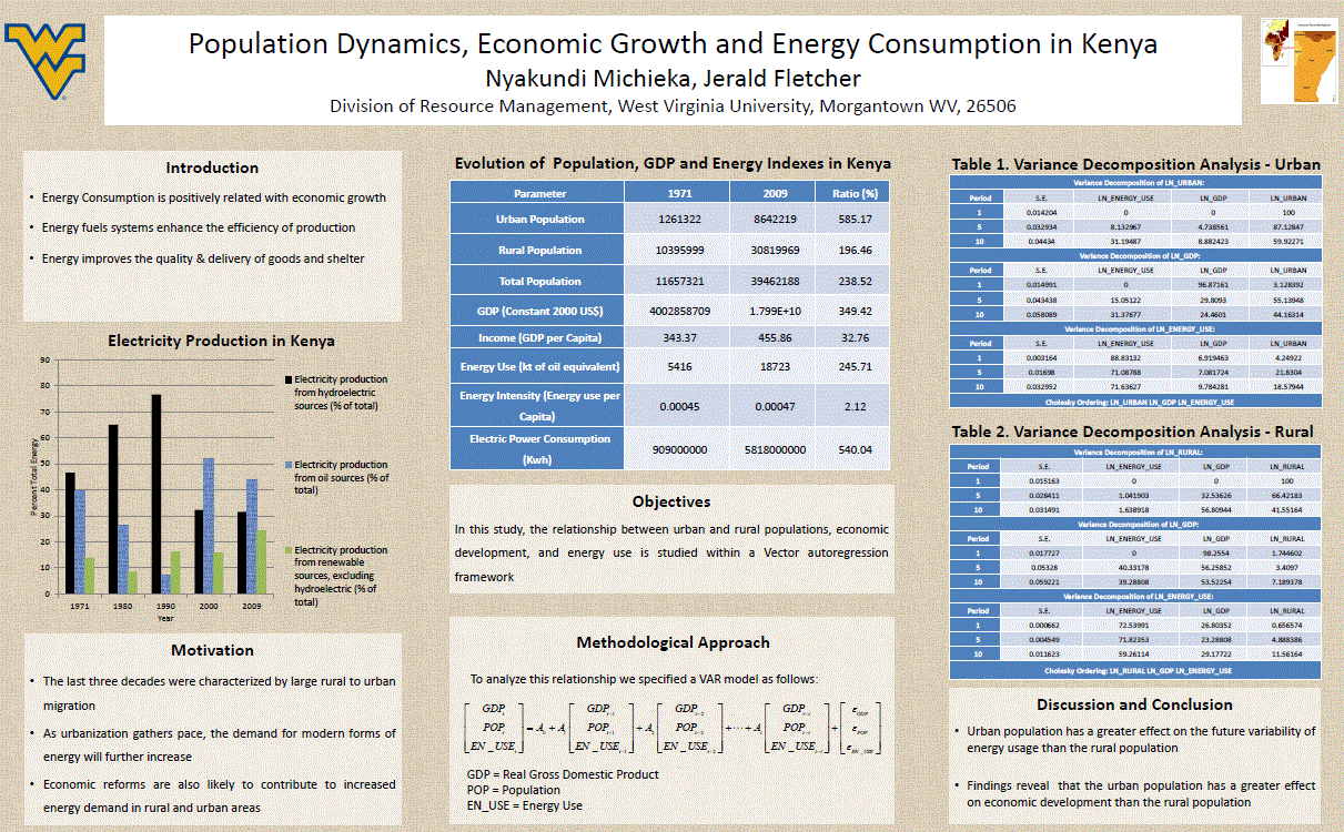
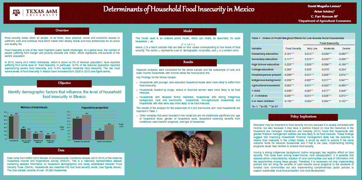
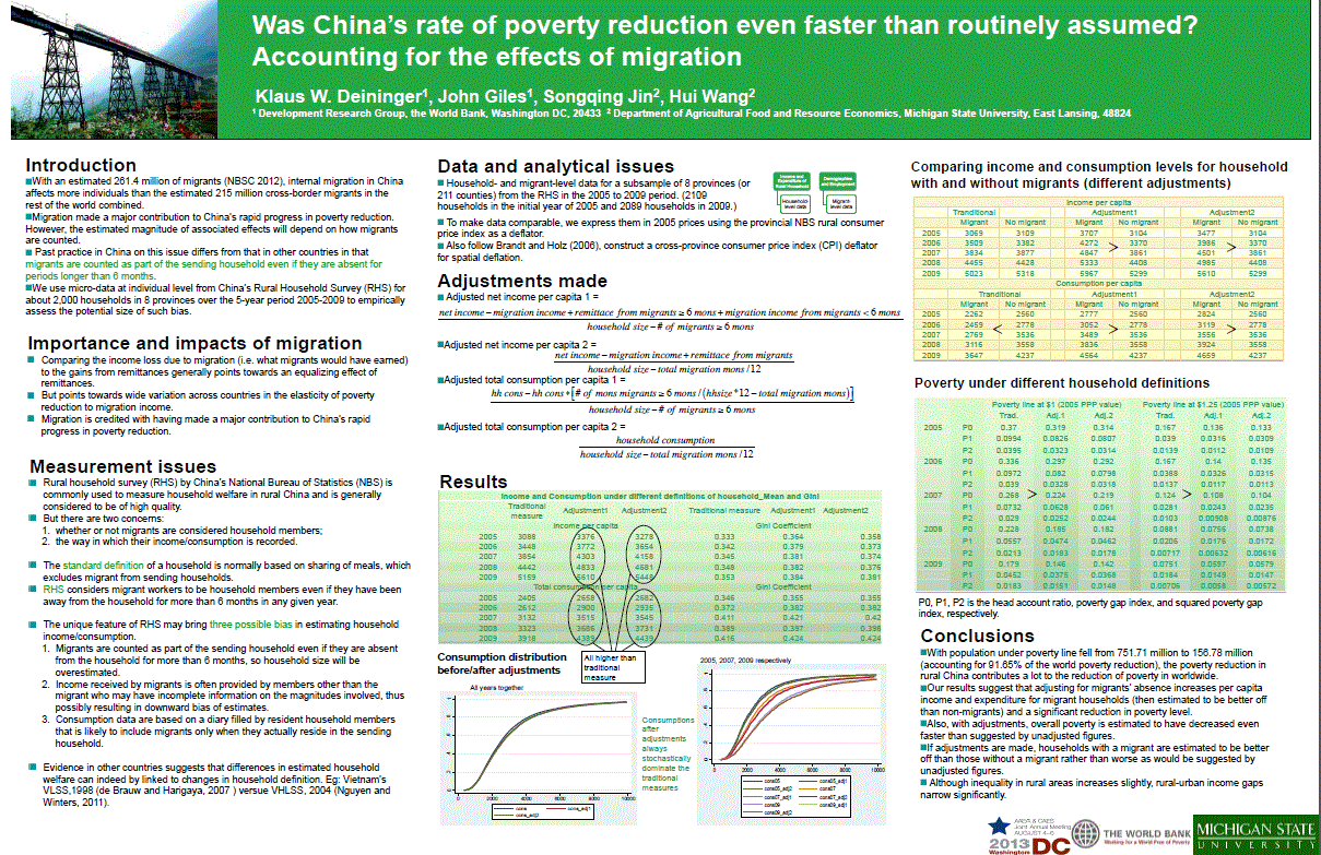
Below you will find a few posters that were displayed at the 2013 Joint Annual Meeting. They are all great examples of how to communicate information in an effective and visually interesting way.
 |
 |
 |
 |