- About
- Registration and Travel
- Events
- Presenters & Participants
- Denver On Demand
- Contact Us

May 14 by 11:59 pm central time
June 18 by 11:59 pm central time
Please prepare a Cover Page using this template and append it to your pdf file before uploading.
As author of the paper, you retain all copyrights. It is recommended that you include a copyright statement at the bottom of the cover page, e.g.
Copyright 2025 by [author(s)]. All rights reserved. Readers may make verbatim copies of this document for non-commercial purposes by any means, provided this copyright notice appears on all such copies.
AAEA requires all poster presenters to print and ship/travel with their posters to our conference site. AAEA does not print and/or ship posters for presenters.
| Address: Sheraton Denver Downtown 1550 Court Pl Denver, Colorado 80202 (303) 218-5465 USA3025@FEDEX.COM |
Hours | |
| Saturday | 8:00 AM - 2:00 PM | |
| Sunday | 12:00 PM - 4:00 PM | |
| Monday | 7:00 AM - 6:00 PM | |
| Tuesday | 7:00 AM - 6:00 PM | |
| Wednesday | 7:00 AM - 6:00 PM | |
| Thursday | 7:00 AM - 6:00 PM | |
| Friday | 7:00 AM - 6:00 PM | |
Please view other shipping instructions here.
Poster printing on-site at FedEx.
All posters will be displayed Sunday through Tuesday. Poster presentations will take place during the Poster Reception, which is scheduled for Monday, July 28 from 4:15 pm until 5:30 pm.
| Poster Setup |
Sunday, July 27 |
8:00 am - 5:30 pm |
| Poster Hours |
Monday, July 28 Tuesday, July 29 |
8:00 am - 5:30 pm 8:00 am - 2:30 pm |
| Poster Reception |
Monday, July 28 |
4:15 pm - 5:30 pm |
| *Poster Take Down | Tuesday, July 29 | 2:30 pm - 4:30 pm |
| *All posters that are not removed by the end of the day on Tuesday, July 29 will be placed on a table near the poster hall. Any posters not picked up by 4:30 pm on Tuesday, July 29 will be discarded. | ||
When submitting your paper to the abstract system you will need to select a subject code. The subject code you select is the category your paper will be grouped in when being reviewed. If accepted, sessions are comprised of abstracts with the same subject codes. To assist you with selecting a subject code the Organizing Committee created keywords for each of the subject codes. We recommend you refer to the keywords for subject codes to help you determine the subject code for your submission.
To help you develop your poster, we have provided a few suggestions below. This is meant as a general overview to get you started.
Size
The maximum poster size is 4 feet high by 8 feet long, minus a 1-inch margin. Your actual poster may be smaller. Pushpins will be provided for you to hang your poster.
Content
Replace text with graphical elements as much as possible (e.g., photographs or maps of study's location, other visual aids to convey key results), but do not forget your complete contact information. Consider including a photograph of the presenting author.
Layout
Clearly indicate your key message. Avoid clutter and unnecessary detail. Don't fight the reader's gravity-pull from top to bottom and left to right. Remember graphical elements, such as balance, symmetry, rhythm, repetition, and change.
Aesthetics
Any text in your poster should be readable from 6 feet away, including text in figures. This means no text should be smaller than a 20-point font. The title should be much larger and readable from a distance (12 feet or more).
Use fonts without serif, but bold. Use dark letters on light backgrounds. Use color carefully; very bright colors can easily fatigue the reader. Stick to a theme of 2-3 colors.
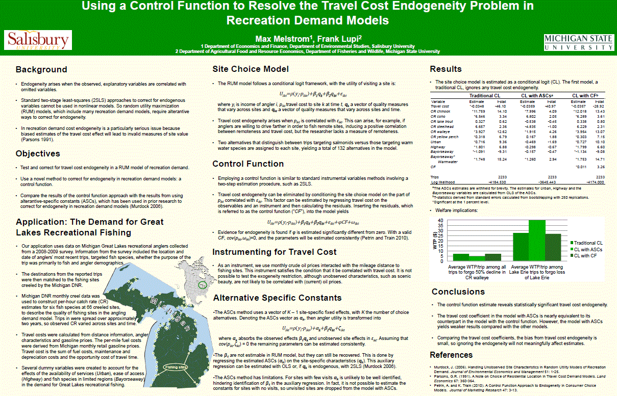
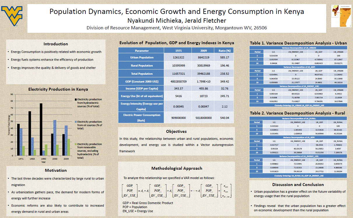
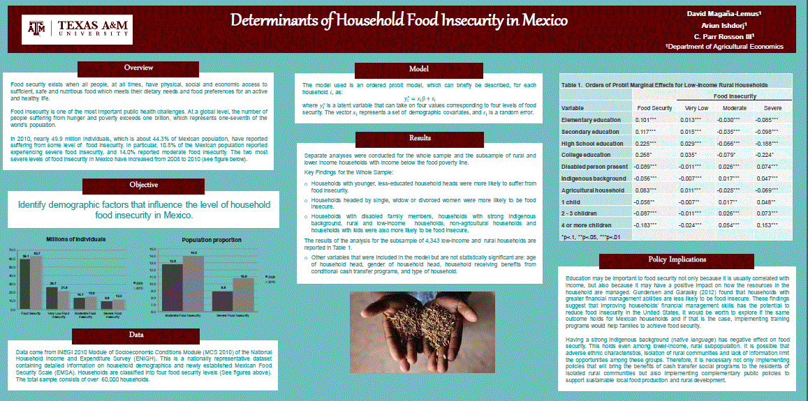
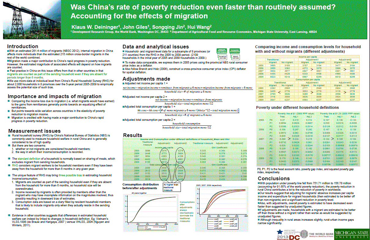
Below you will find a few posters that were displayed at the 2013 Joint Annual Meeting. They are all great examples of how to communicate information in an effective and visually interesting way.
 |
 |
 |
 |